When my husband, Eric, and I found out we were having a boy (Victor), we were ecstatic to transform our guest room into a fun and vibrant space where our son could create, explore and imagine.
 |
| custom mural |
 |
| chalkboard wall |
 |
| vintage touches |
 |
| handmade felt pillows |
 |
| accessories |
When we were discussing the nursery, my husband mentioned that he really wanted a mural. For fear of the
“cheese” factor, I did not. After some convincing, I eventually came around.
To create a modern mural, we followed a few simple rules.
- A cool and personal theme. Since we live in a mid-century home, we decided on a 1950s atomic theme with the Portland skyline being invaded by UFOs! And since we both share a love for architecture, we wanted to incorporate some of Portland’s iconic buildings and landmarks (the St. John’s Bridge, Mt. Hood and Union Station where daddy works as an engineer.) We also included some special places in Portland that we have grown to love (i.e. Bantam Barbershop, the Hollywood theater, Toro Bravo, etc.).
- A muted color palette. For several reasons. First, to keep things simple. Incorporating a lot of colors would create a very busy and overwhelming space. Second, to keep things modern. We chose to do the majority of the mural in a gradient of grays with some key elements highlighted in vibrant colors. The beam of light over the crib was done in an electric green. The mini hot-rod was done in a bright orange. This allows your eye to focus and be drawn to certain areas of the mural, rather than leaving your eye bouncing around the room searching for a focal point. A dark chalkboard wall anchors the space and provides the perfect place for photo opportunities and messages to our son. As he grows older, he will be able to utilize it to draw and create his own works of art.
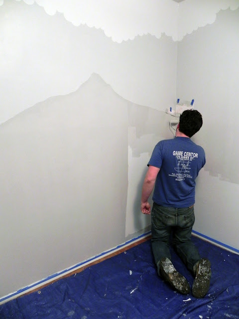
- Clean lines and composition. We started out with a few sketches of the mural and played with the scale and composition of all the elements until we were satisfied. We used painter’s tape and card stock to create very straight, clean lines for all the buildings, which contrast nicely with the organic aesthetic of the clouds and the mountain. We did the mural in layers starting with white, building up the clouds, sky, mountain, buildings, bridge, etc. ending with the colored elements and other details. We used larger rollers for the bottom layers, and mini rollers for the building layers. Painters tape, exacto knives and a lot of man (and woman!) hours were essential in creating the building and detail layers.
Here are a few process photos:
Because we
are mid-century enthusiasts, we wanted to incorporate some vintage touches
along with some modern pieces. Both the dresser and the rocking chair were
excellent Craigslist finds, while the crib (Target), rug, drapes and light
fixtures (Ikea) we purchased new. We opted for a dresser rather than a
traditional changing table because it will have a longer life in the space. I
found a modern changing tray from Muu kids which holds the changing pad and
anchors to the dresser. Vic’s room has
an enormous built in closet which stores all his blankets, hanging clothes and
toys, leaving the center of the room clear for playing. For a personal touch,
Eric and I handmade a few felt pillows in the shape of a space ship and
aliens. We accessorized the space
with a few artifacts that we have gathered through our travels and homemade
gifts we received from friends and family.
We are both
so pleased with the way the nursery turned out. We look forward to watching Vic
grow up and we hope that the space stimulates his creativity and imagination.
Nursery 51 has been featured on Apartment Therapy and is soon to be featured on HGTV's new remodeling website! Check out the links below:
Annie Wise
owns a small interior design company located in Portland, OR. All photographs courtesy
of Annie Wise. Visit her website at www.anniewise.com.


