Tuesday, July 28, 2015
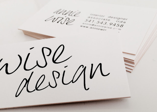
New business cards!
They are here! After months of painstaking design revisions, countless fonts and placements (some say I am a perfectionist), we finally printed some lovely new business cards and I couldn't be more pleased. They have a fancy yellow band around the edges. And, they are thick. Thick, thick. Like a coaster. So if you get one of these babies, feel free to set a tiny drink atop it. Cheers. #moo
Tuesday, June 9, 2015
Lake Oswego Farmhouse Remodel Update
Wise Design helped this large family realize their vision for a charming, airy farmhouse kitchen. The existing space was small and cluttered with a major lack of storage. We designed a new plan for the kitchen by removing the existing kitchen and extending it across the whole width of the house. To accommodate their large family, we incorporated a large central island with bar seating. We designed traditional inset cabinetry with a full height pantry on the fridge wall, a small desk cabinet for mail and a hoosier style cabinet to display glassware. We removed the original entryway door to the kitchen and created a built-in dining banquette. To add some farmhouse charm, we paneled the ceiling, added an apron front sink, detailed the cabinets with corbels and used traditional cabinet latch hardware. Scroll down to the bottom for a "before" picture.
Friday, May 29, 2015
Alberta Craftsman Remodel Upate
We are finally wrapping up the Alberta Craftsman house that we've been working on for over a year and a half! We transformed the kitchen by knocking down a wall to extend the space and introduced another window to flood the kitchen with light. We created a peninsula with storage and bar seating. We removed the upper kitchen cabinets, which were replaced with floating walnut shelves beneath a fully tiled wall. The dark countertops were updated with a marble patterned quartz. To add storage, we designed a hutch that adds character to the space.
The unfinished basement was a daunting design challenge with bare concrete walls and low ceilings. The space planning included adding a full bath, laundry facility, lots of storage and a flex-use space. A large concrete abutment wall was our biggest obstacle, which we chose to turn into a lofted daybed area. We kept the palette light and bright and installed luxury laminate flooring to match the original hardwood floors in the rest of the house. We designed a variety of custom cabinetry, including concealed laundry cabinets, vertical clothing storage with a fold-down ironing board, and deep storage cabinets for large items. Mirrors were utilized to reflect light in the basement and make the space appear larger.
Subscribe to:
Comments (Atom)


